contact us

Whether you are a homeowner, an industry professional, fellow blogger or just curious to know more about the place home, we are excited to hear from you. 

Email us directly at theplacehome@gmail.com, connect with us through social media or submit the form!


123 Street Avenue, City Town, 99999

(123) 555-6789

email@address.com


You can set your address, phone number, email and site description in the settings tab.
Link to read me page with more information.

THE-PLACE-HOME-blog-banner-final.jpgasdfsdf

blog


Filtering by Category: Resource Review

more american dream builders

Emily Oster

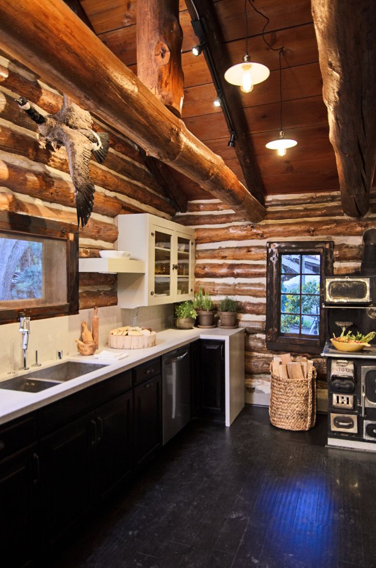
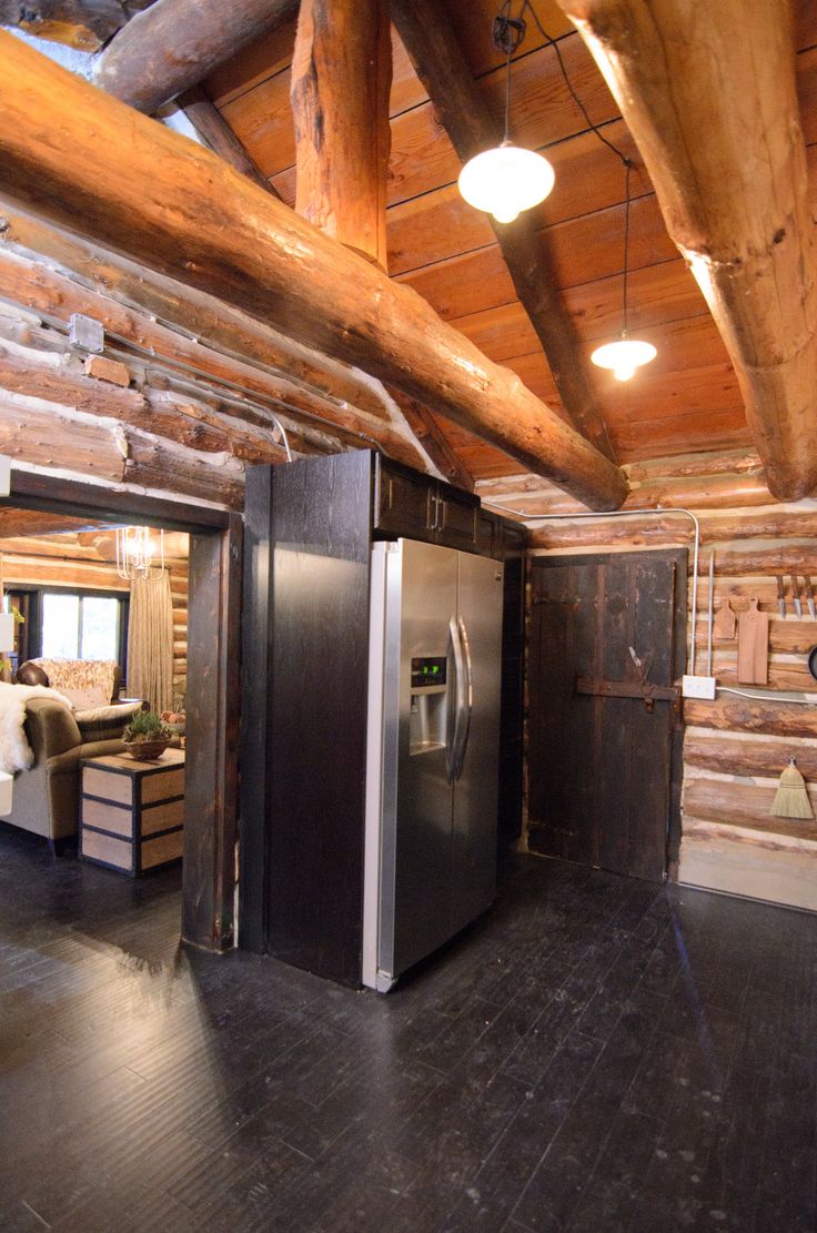
I love an excuse to start my day off slowly - sit on the couch or in bed and catch up on my blog reading, listen to NPR and drink some coffee and eat breakfast. Today, I was feeling especially reluctant to get up and moving so I thought I would catch up on the latest episode of American Dream Builders. An episode of the series aired this past Sunday and Monday which makes me think it might not be getting great ratings but who knows how those things work. Anyways, this week the teams were tasked with renovating two cabin retreats in Big Bear and I have to say it was a big let down. I really only liked one room - Lukas' kitchen. It was a great blend of modern and traditional and I think could hold its own in "the real world" of design. 
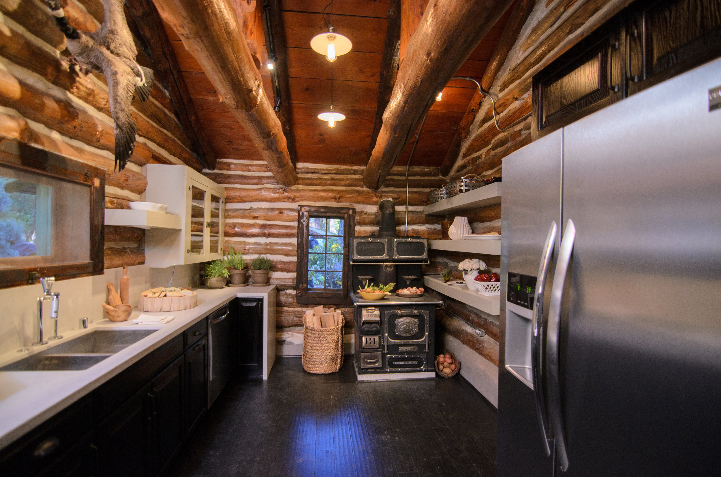
Lukas, who is on the red team, has become the standout designer for me. He seems to be the most creative of the bunch in addition to being quite likable. That being said a quick Google image search of his work is pretty scary so I will be curious to see how his designs progress throughout the competition.

The other interesting takeaway from Monday's episode are Nate Berkus' thoughts. He does these wrap up videos that are posted on NBC.com and this week he really goes after other TV design shows. He says "people are used to seeing the same type of design over and over again on TV. Whether they know it or not its always the same five takeaways and there really is very rarely anything brand new". He goes on to say that he thought Lukas' kitchen was something new and innovative which I agree with; but a lot of the rooms that have been designed thus far have been pretty generic especially in this episode. 

Next week, the contestants will be redesigning modular homes - hopefully, it will be an improvement over the designs in this episode...
back from high point and american dream builders

Emily Oster

I am dragging a bit this morning as I got back late last night from High Point furniture market. I saw so many beautiful things and am super excited to do a whole mini series about my first experience at the "fashion week" for furniture. However, I need some time to sort through my photos and put my thoughts together so today I want to give a review of the third episode of American Dream Builders.

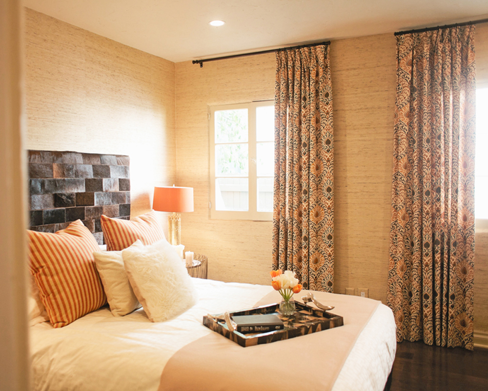
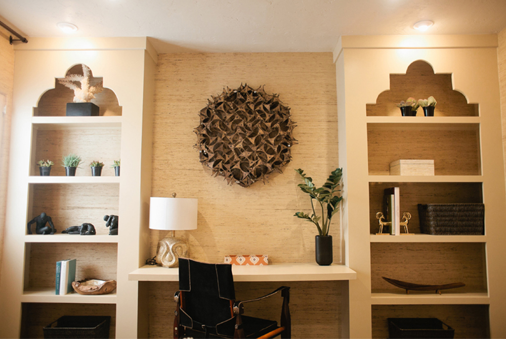
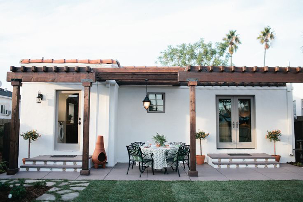
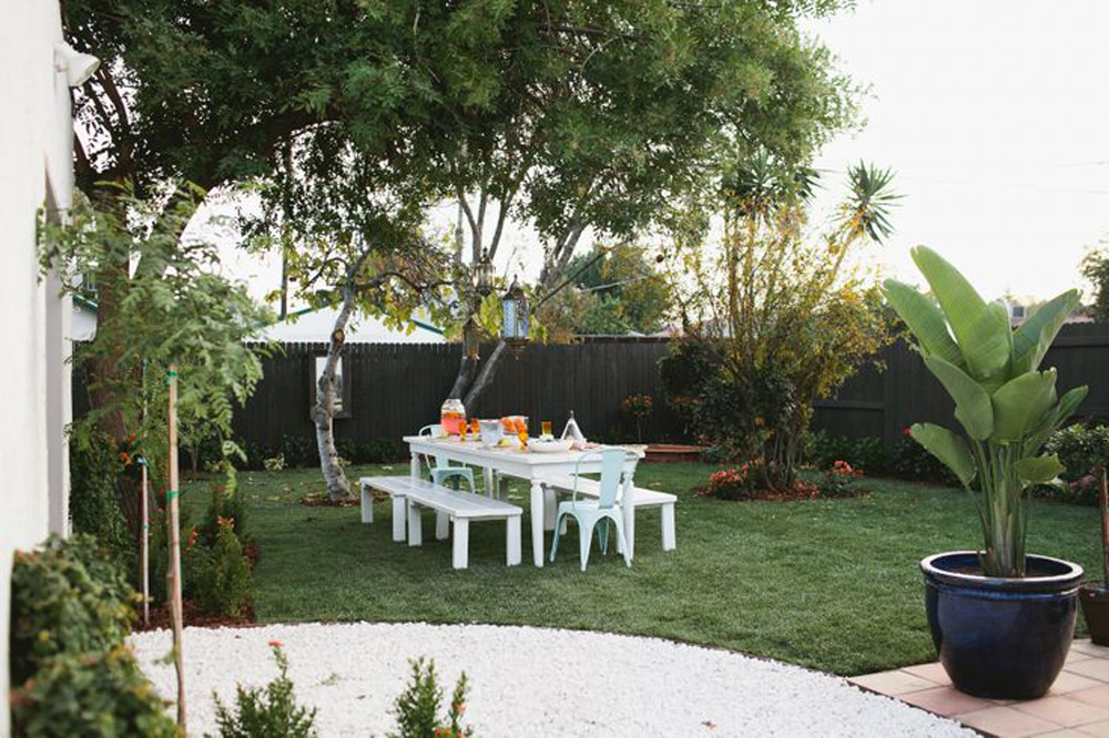
This week the two teams were tasked with renovating Spanish style homes. The homeowners are "embarrassed" of their spaces...and thats all they really reveal about the clients. I think the homes were pretty evenly matched although the red team broke their losing streak and came through with the win. My favorite room was the bedroom done by Nina Magon on the blue team. Nate Berkus makes a point to say this was his favorite room thus far and I have to agree. I love the built in bookcases and desk as well as the great combination of textures.

I also really liked the outdoor spaces of both teams designed by Darren Moore (blue) and ????. Maybe I missed it but in both the actual episode and in the recap it doesn't credit one designer from the red team. 

Also left out from both the episode and recap is this red team bathroom which I came across in the episode's online gallery. 

The lack of information and images is really quite frustrating. Its almost like the show's team completely forgot to document the contestant's work. I also still don't like all the product placements also this week the team's got to shop at Lawson-Fenning - a manufacturer of furniture that we use and really like. 

My least favorite room's were the dining room by Erinn Valencich of the red team and kitchen by Christina Salway of the blue team who was ultimately sent home. Overall, I would say each episode is an improvement over the previous and I am looking forward to catching up on last night's episode in which they redesign a mountain cabin. 


american dream builders week 2

Emily Oster

This week, the teams were tasked with overhauling two midcentury homes in Palm Springs. The teams remained the same and so did the dramatics of the designers but the design was much more elevated....or shall I say some of it was. The pluses and minuses from last week pretty much stand although they seem to have been able to shop at more interesting places this time around. The blue team triumphed again making for the second loss in a row for the red team. That being said the red team's living, kitchen and den spaces created by team leader Lukas Machnik, Dann Foley and Vanessa DeLeon were my favorites from this week.  

design by Lukas Machnik via NBC.com

design by Lukas Machnik via NBC.com

design by Dann Foley via NBC.com

design by Dann Foley via NBC.com

design by Vanessa DeLeon via Zillow

design by Vanessa DeLeon via Zillow

I also liked the living room by Elaine Griffin of the blue team. However, she might be the most annoying TV personality I have ever watched and I think the show will become much better when/if she gets kicked off. 

design by Elaine Griffin via AOL

design by Elaine Griffin via AOL

I am still not totally hooked but this week's episode was enough for me to tune in next week. Week 2's full episode is available online at NBC.com. Check it out!