contact us

Whether you are a homeowner, an industry professional, fellow blogger or just curious to know more about the place home, we are excited to hear from you. 

Email us directly at theplacehome@gmail.com, connect with us through social media or submit the form!


123 Street Avenue, City Town, 99999

(123) 555-6789

email@address.com


You can set your address, phone number, email and site description in the settings tab.
Link to read me page with more information.

THE-PLACE-HOME-blog-banner-final.jpgasdfsdf

blog


Filtering by Category: Living

spindle beds

Emily Oster

There is something that I really love about spindle beds. I can't totally place what it is but I think it has to do with how easy they transition across styles - country to modern and everything in between. I also really like how most are elevated off the floor making the bed its own private space. Here are a few of my favorites: 

1. Noir Trading Ferret Bed via Lonny   2. Gwendoline Spindle Bed by Bradshaw Kirchofer Handmade Furniture  3. Jenny Lind Bed by Land of Nod  4. Room by Tilton Fenwick  5. Via Elle Decor  6. Via Better Homes and Gardens&…

1. Noir Trading Ferret Bed via Lonny   2. Gwendoline Spindle Bed by Bradshaw Kirchofer Handmade Furniture  3. Jenny Lind Bed by Land of Nod  4. Room by Tilton Fenwick  5. Via Elle Decor  6. Via Better Homes and Gardens  7. Beach Cottage by Sarah Scales  8. House on Martha's Vineyard by Ferguson & Shamamian
bedroom makeover proposal

Emily Oster

As a sort of continuation of Jenn's closet makeover, I am helping Jenn and her husband Mike update their master bedroom. This past Wednesday, we got together and I presented them with two slightly different design schemes.

First, some background on the project. Jenn and Mike have two very sweet dogs. One that is around 40 pounds and one that is around 160 pounds. They both sleep in the bedroom and they both shed a lot. So our first design criteria, which is not a bad thing but often helpful in making decisions, was selecting a color scheme that would hide dog hair. Our second design consideration was that they both really like color. Lastly, Jenn has a dresser that was her grandmother's that she wanted to incorporate into the room. 

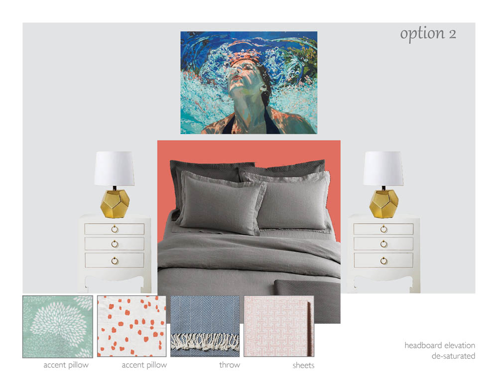
Over casual conversation, we decided on a color scheme to start from - coral and gray. A coral padded headboard to be made by Mike, light gray walls to warm up the space and predominately gray bedding to hide the dog hair. We also decided that since the dresser is not in great shape, we would have to have something done to it - maybe lacquered navy and add brass hardware. After that, Jenn and I exchanged some images and I set to work on creating a plan. This is what I presented to them:

Painting by Samantha French, nightstands, sheets and throw by Serena and Lily, fabrics by Quadrille, bedding by Restoration Hardware, lamps unknown

Painting by Samantha French, nightstands, sheets and throw by Serena and Lily, fabrics by Quadrille, bedding by Restoration Hardware, lamps unknown

Painting by Samantha French, lamps by Land of Nod, bedding by Restoration Hardware, sheets and throw by Serena and Lily, fabrics by Quadrille, nightstands by Bungalow 5

Painting by Samantha French, lamps by Land of Nod, bedding by Restoration Hardware, sheets and throw by Serena and Lily, fabrics by Quadrille, nightstands by Bungalow 5

Key to both designs is a Samantha French reproduction that ties the whole room together. However, as I explained to Mike and Jenn if they didn't love it we should look for another piece of art within the same color palette. As I blogged about in my post, art in the home, art brings so much to a room and can be a great thing to organize a room around. It is also extremely personal so go with what you love. Both designs also present an approach to the design that is not super matchy matchy but rather contrasts colors and patterns. This makes a room more unique and personalized. Option 1 represents a more saturated color palette with a more textured and casual feel while Option 2 has
de-saturated color scheme with a slightly more glamorous feel. 

The options I showed to Jenn and Mike were really just a starting point and what they ultimately decided was that while they really like the color coral now, they worried that they might grow tired of it. So back to the drawing board for some revisions...stay tuned!


happy fourth of july (almost)

Emily Oster

In honor of the holiday, I will not be posting tomorrow or Friday. Hopefully, many of you will also be taking a few days off. So to celebrate the fourth, I have put together a little collection of red, white and blue themed art that I enjoy. 

1. Finale, 2008, oil on canvas, Philip Barlow image via Johns Borman  2. Illustrated Alphabet inspired by the London Olympics 2012, Charlotte Trounce  3. Color Study No.5, 2012, acrylic on canvas, Emily Rickard  4. Right, mixed media,…

1. Finale, 2008, oil on canvas, Philip Barlow image via Johns Borman  2. Illustrated Alphabet inspired by the London Olympics 2012, Charlotte Trounce  3. Color Study No.5, 2012, acrylic on canvas, Emily Rickard  4. Right, mixed media, Madeline and Robert Longstreet image via One Kings Lane   5. Emma McNally  6. Massimo Vitali