contact us

Whether you are a homeowner, an industry professional, fellow blogger or just curious to know more about the place home, we are excited to hear from you. 

Email us directly at theplacehome@gmail.com, connect with us through social media or submit the form!


123 Street Avenue, City Town, 99999

(123) 555-6789

email@address.com


You can set your address, phone number, email and site description in the settings tab.
Link to read me page with more information.

THE-PLACE-HOME-blog-banner-final.jpgasdfsdf

blog


Filtering by Category: the beautiful home

open metal shelving

Emily Oster

One kitchen trend I can really get behind is open metal shelving. Whether it is brass, iron, copper or chrome - I love the added interest and texture it brings to a space. Also unlike solid cabinetry, it makes a kitchen feel more open and brighter while still providing a cost effective storage solution. Below are more than a few favorite examples. 

from top left - Hawaiian vacation home designed by Michelle R. Smith via DOMAINE - retail brass shelving via source unknown - commercial brass shelving via DISC JOURNAL - 1930s French Bistro Shelving via Restoration Hardware - LA home of Gwynet…

from top left - Hawaiian vacation home designed by Michelle R. Smith via DOMAINE - retail brass shelving via source unknown - commercial brass shelving via DISC JOURNAL - 1930s French Bistro Shelving via Restoration Hardware - LA home of Gwyneth Paltrow via Popsugar - full height iron shelving via COCO COZY - home of Susan Greenleaf via Lonny - industrial kitchen design by Ingrid Oomen via Style At Home - home of Lauren Liess - 2012 Kitchen of the Year via House Beautiful - DIY copper shelving via Apartment Therapy
tips for shopping at IKEA

Emily Oster

We are planning a quick trip up to Chicago in the near future and I am debating an IKEA visit. I hadn't trolled the mega store's website in a while and found some pretty cool new pieces that might be worth a detour.

I think the key to shopping at IKEA is to know that it shouldn't ALL come from IKEA. You should be selective and think about what elements you can mix in to elevate a particular item. My big generally rule is to hone in on more accent pieces rather than major staple items as 1.) I would worry about the quality of say a sectional and 2.) their pieces tend to be more on trend and its nice to be able to purchase these types of items without making a huge investment. To further speak to point number 1, I look at items where quality control is maybe not as big of an issue. For example, I probably won't buy a large area rug from IKEA for fear of it shedding all over the place and quickly falling apart. I would (and have) purchase a cowhide as it is obviously a natural material that is pretty much the same whether you buy it for $200 or $1000. To further elaborate on point number 2, I would not plan a space around an IKEA item or if I did I would use it as more of a stand in item while I searched for its replacement. This is because again a nervousness about quality and use but also because I think great spaces are full of items meant to last. You can just sort of feel a richness and depth to a space when it contains pieces that were handcrafted and produced/selected with care. 

Take this MELLBY chair for example. 

This is what I might regard as a great stand in piece. You could purchase one or a pair of these chairs and they could look amazing in a space. Upholstered chairs are, however, more of a staple piece than an accent item. Meaning that if used a lot or placed in direct sun it will most likely show wear fairly quickly and will need to be replaced sooner rather than later. Perhaps with this Goodland chair from Design Within Reach which looks almost exactly like it but will most likely stand the test of time and wear much better. 

Another example of a stand in piece would be this STOCKHOLM swivel chair

Now this chair I would guess might wear better than the MELLBY because its velvet and not such a dark color. If/when it needed replacing I would look to something vintage because it has sort of a mod 70's vibe to it. Something like these Milo Baughman swivel tube chairs for Thayer Coggin.

via 1st Dibs

Another vintage inspired/reproduction IKEA item is this ARJEPLOG light. 

For me, this light is more of an "on trend" item that I might eventually want to replace with something different. However, it is a copy of a very classic design by Stilnovo

Diabolo pendant by Stilnovo via First Dibs

Diabolo pendant by Stilnovo via First Dibs

Other current IKEA items that I just like and could work as more accent pieces include this funky little outdoor bench...

This interesting floor lamp...

And this media unit which I think could be cool used as a bench...

Want to see more IKEA picks? Check out this old post.

fixer upper season 2

Emily Oster

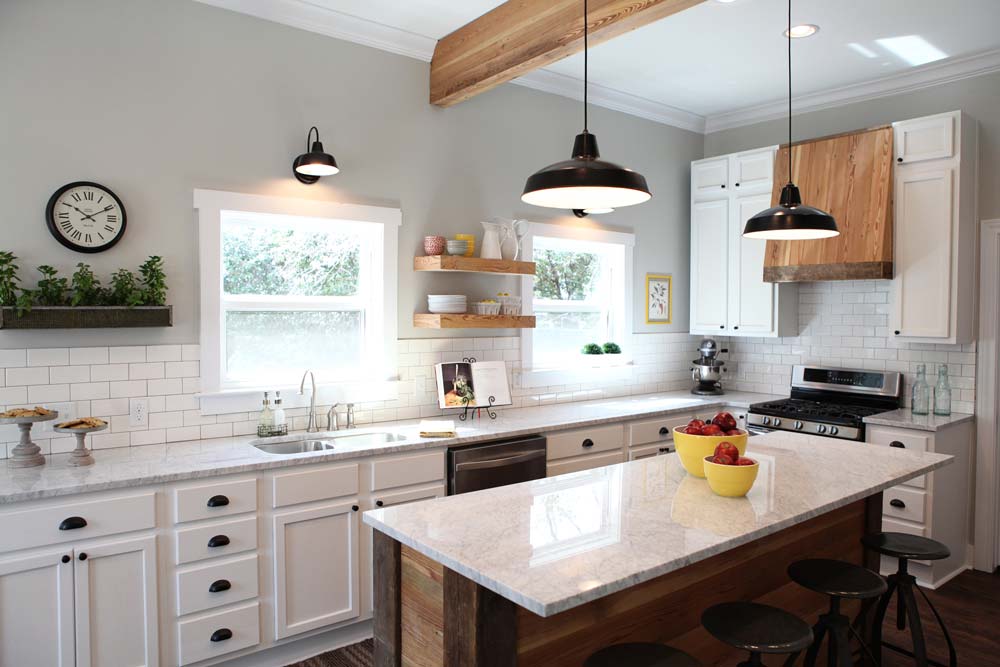
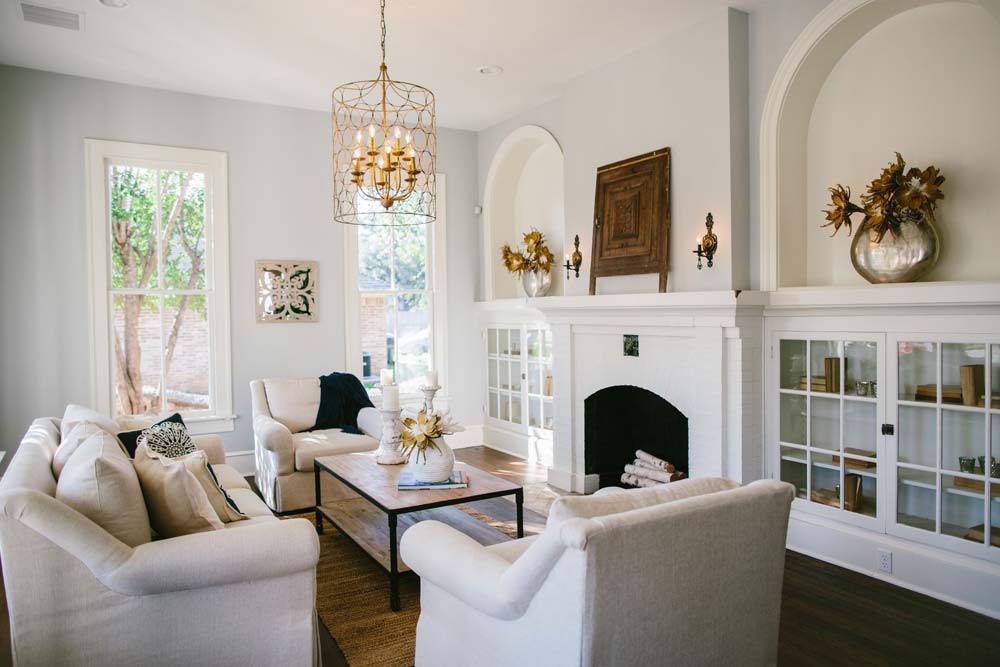
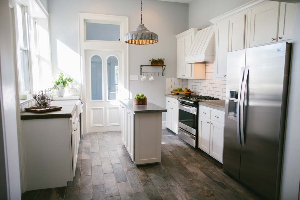
I must not have been the only person to enjoy the pilot season of HGTV Fixer Upper as Chip and Joanna Gaines are back for round two. Airing Tuesday nights at 8 PM central, the show's format is pretty much the same as the first season which I think is a good thing (see my original post about the show here). Chip and Joanna are just so easy to watch as they seem to be genuine people who truly enjoy what they do. Below is a selection of my favorite home transformations from both seasons one and two. 

This house was maybe in the worst condition of any of the homes featured on season one. The house had been abandoned for several years and was probably close to being condemned. Miraculously, Chip and Joanna were able to bring it back to life and make it a great home for their carpenter and his young family. 

In episode eleven of season one, the Gaines undertook this outdated country home and I just love the exterior transformation. And that tree!

The last episode of season one is maybe my favorite to date.  The architecture of this particular home was just so unique and desperately needed to be saved and preserved. 

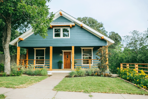
In the first episode of season two, the Gaines did a really nice job of giving back character to this historic bungalow. I especially like the paint color with the natural wood accents as well as the landscaping.

In this week's episode, Chip and Joanna were tasked with renovating this horrible exterior very clearly from the 80s. And while its still not great (bad bad bad proportion and scale) its about a thousand times better. 

If your interested in seeing more - watch the show! And check out the Magnolia Homes website as well as Joanna's blog.

Have a great weekend everyone and happy watching!