contact us

Whether you are a homeowner, an industry professional, fellow blogger or just curious to know more about the place home, we are excited to hear from you. 

Email us directly at theplacehome@gmail.com, connect with us through social media or submit the form!


123 Street Avenue, City Town, 99999

(123) 555-6789

email@address.com


You can set your address, phone number, email and site description in the settings tab.
Link to read me page with more information.

THE-PLACE-HOME-blog-banner-final.jpgasdfsdf

blog


Filtering by Category: the beautiful home

planning our curb appeal

Emily Oster

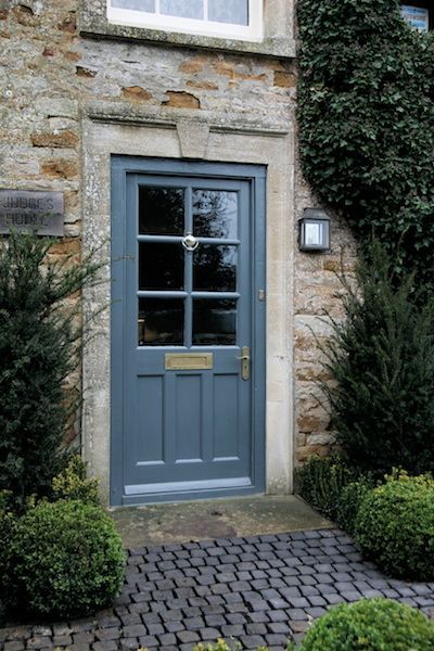
Spring has definitely sprung here and I am itching to finish my ongoing indoor projects to get outside. I already wrote about how the front yard is much easier for me to get my head around so most of my dreaming has been focused there. Today's current obsessive thoughts are aimed at the general curb appeal of our house. The front door color has to be changed first and foremost (see this post). I am 90% positive that I want to a dark blue/grayish color. Hague Blue by Farrow & Ball is a really pretty dark blue that would probably look almost black in shade. 

hague blue door via Tom Handbury Photography

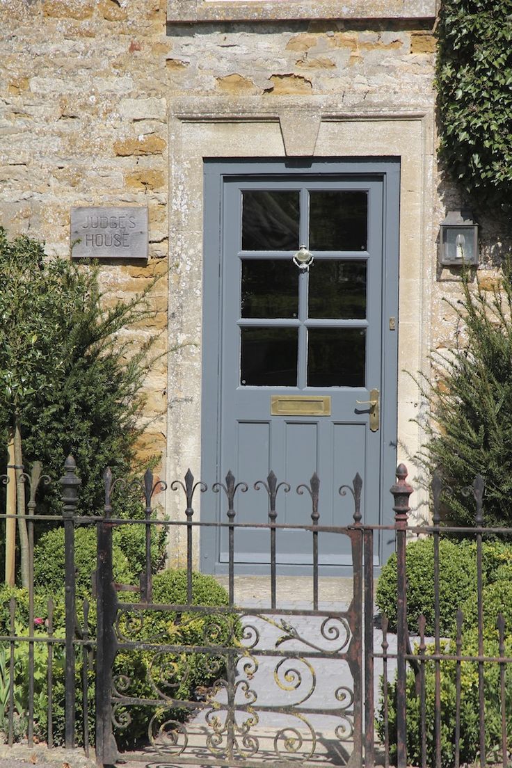
hague blue door via Tom Handbury Photography

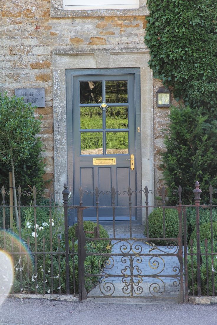
My concern with the Hague Blue, while being a very true navy, might be too blue for me. Downpipe, also by Farrow & Ball, is another top contender. Its not blue but rather a gray that lends itself a little towards the blueish-greenish tone.  The below images from Hendy Curzon are super helpful as it shows how the color is transformed depending on the season. The furthest left is winter, the middle is spring and the final is summer. 

Farrow & Ball sells mini-sample pints so I think what I will do is just try these two and see what I like. I also might order the color Railings....

The other element I am really looking to add to our front stoop is some pots. Nothing two fancy just two larger scale planters either in zinc or concrete. I really like these front pots with the white bushy flower. 

I want something sort of free form and wild. I am thinking mostly green with maybe just a hint of white or color. Lavender could be pretty...

via Pinterest

I also want to get a new door knocker as the current one says the name of the old homeowner. I would love to find something vintage and brass. There are, of course, about ten other things I would like to do to add curb appeal to our house but these things seem like a good place to start. 
antique rugs in the bathroom

Emily Oster

We were given a really beautiful 2' x 3' antique rug and, until recently, I had it placed at our front door. The problem was it just looked sort of tiny and unimpressive in the space. 2' x 3' rugs are challenging in that they are too small for most spaces. With rugs, you generally want to size up so a 2' x 3' can be hard to make work. I tried ours in different spaces around the house without much success UNTIL I moved it to the bathroom. Then it was WOW! Our bathroom is rather boring with contractor grade finishes but putting our vintage rug in there instantly gives the room more depth. It also is the perfect piece to build the room around. I am thinking new vanity, fixtures and mirror, hang some art and old hooks and then paint the built ins a shade of blue. Below are some examples of antique rugs in bathrooms that are serving as my inspiration. Happy Monday!

from top left - home of Beth and Chris Collier via Garden & Gun - home of Amber Lewis via DOMAINE - via Studio McGee - via Sarah Richardson Design - via REMODELISTA - source unknown - home of Sheryl Crow via Architectural Digest - design by GP S…

from top left - home of Beth and Chris Collier via Garden & Gun - home of Amber Lewis via DOMAINE - via Studio McGee - via Sarah Richardson Design - via REMODELISTA - source unknown - home of Sheryl Crow via Architectural Digest - design by GP Schafer Architects - via Hooked on Houses

animal patterns for kids

Emily Oster

Lately, I have been seeing lots of cute kids room (see my Design|Kids Pinterest board). This, of course, got me thinking about my favorite elements for little one spaces. There are tons of adorable, fun and whimsical designs out there for babies and kids but perhaps my favorite grouping is animal patterns. What makes for a cuter pillow or floor cushion than brightly colored elephants or walls covered in a safari print! Below are some of my stand out animal patterns - textiles and wallpaper - that would look awesome in a space for the little ones and I am rather tempted to use in a grown up space! Have a great weekend everyone!

from top left - fabric by Josef Frank, room design source unknown - Parade by Schumacher - Folkland by Dwell Studio for Robert Allen - Celadon Wildwood by Dwell Studio - Safari (blush) by Hygge & West - home of Erika Brechtel maho…

from top left - fabric by Josef Frank, room design source unknown - Parade by Schumacher - Folkland by Dwell Studio for Robert Allen - Celadon Wildwood by Dwell Studio - Safari (blush) by Hygge & West - home of Erika Brechtel mahout pattern by John Robshaw for Duralee - Zebras by Scalamandre - Long Dog by Emily Bond