contact us

Whether you are a homeowner, an industry professional, fellow blogger or just curious to know more about the place home, we are excited to hear from you. 

Email us directly at theplacehome@gmail.com, connect with us through social media or submit the form!


123 Street Avenue, City Town, 99999

(123) 555-6789

email@address.com


You can set your address, phone number, email and site description in the settings tab.
Link to read me page with more information.

THE-PLACE-HOME-blog-banner-final.jpgasdfsdf

blog


Filtering by Category: the beautiful home

designer feature: jute interior design

Emily Oster

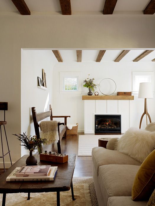
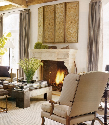
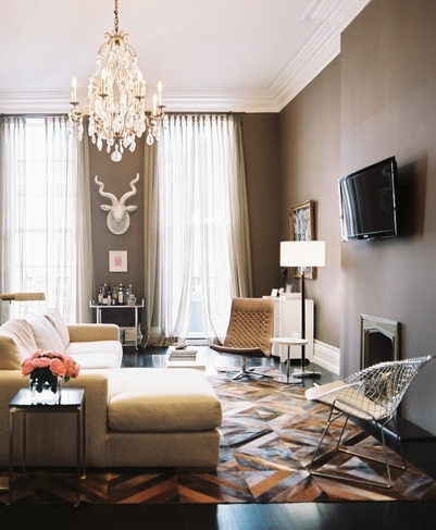
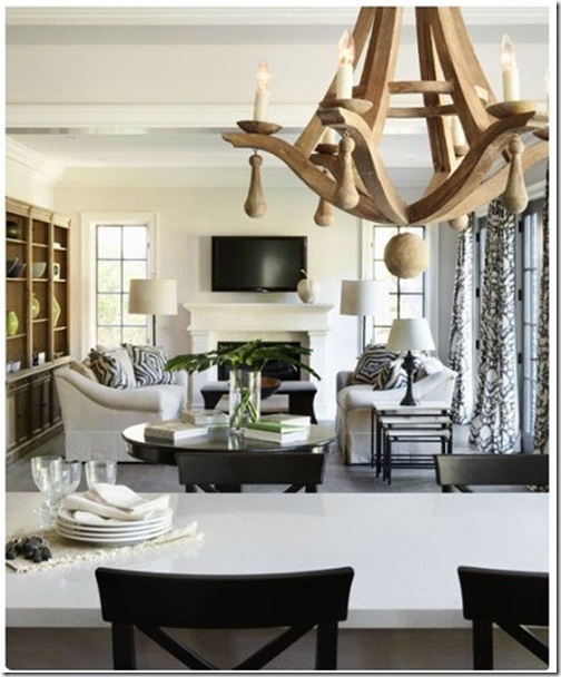
Based in San Francisco, Jute Interior Design is known for its "urban earthiness" (Lonny). Started by Ali Davin, the firm blends "unique furnishings and finishes into living spaces without fuss or clutter" (Jute). Their interiors are sculptural, clean and effortlessly blend the antique with the modern. Below are a few favorites.

Also as a follow up to last week's exterior paint color post, I came across this GARDENISTA entry which has most likely convinced me not to paint our house black. 

exterior paint color

Emily Oster

It is a very gray wintry day here in Saint Louis. We got a good snow accumulation Saturday and then it rained last night so things are looking quite brown. It reminds me of Michigan in late March - brown, dirty piles of snow and, of course, overcast. The winters in Saint Louis are significantly clearer than I experienced growing up in Michigan but we still get a large number of gray days. And it is on these days that I really notice some one off house colors. That gray that is really purple or the tan that definitely is light pink or our house's beige color that tints green to look like baby poop.....which is to say I have started thinking about repainting our exterior.

As usual, I am not sure when this particular home project will happen but mostly likely it will be during the warmer months. This means, however, that I won't have the opportunity to test colors in the flat, tricky light of winter. As such, I plan to keep an eye on house colors in the neighborhood that I like, research what palettes look the best all year round and then finally photograph our house in multiple lights - times of day and seasons - so that when we are selecting colors I can remember not to select anything that might even come close to looking like it came out of Booker.....

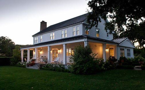
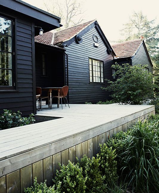
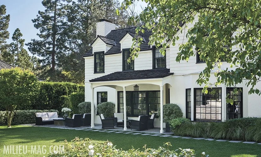
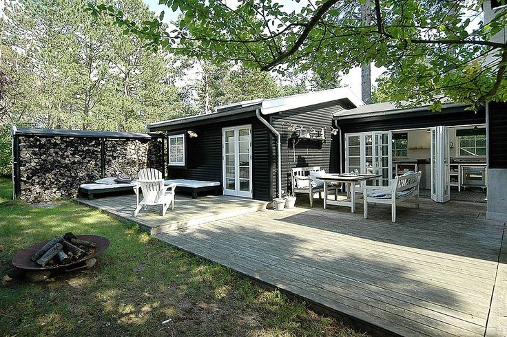
In the meantime, I have gotten the search going by just looking broadly at different exterior color palettes and checking out REMODELISTA and GARDENISTA for related posts. The first two colors I instantly gravitate towards are white and black. A white house is just classic and a black house is unexpected yet timeless as well. 
Or a white and black combo.

The problem with white is that our house exterior is stucco and I am worried about the maintenance as well as how much it will emphasis the rough texture. The challenge with black is that I would have a really hard time convincing Jeff to go for it and it might be even a little daring for me. 

I also like the idea of a really dark green. 

It would have to be just the right shade - not too blue and not too light. It is really hard to find examples of well done dark green exteriors so that makes me a little nervous as well. 

Then, of course, there is the overwhelming idea of doing gray or tan. The two are probably the most popular selections but there are just so many shades of each that I get dizzy just thinking about it.

Clearly this is going to take a while....

from top: source unknown - source unknown - original architectural design by Gerard Colcord and renovated by Tom Boland via Milieu Mag - source unknown - design by Bill Ingram Architects

tv above the fireplace

Emily Oster

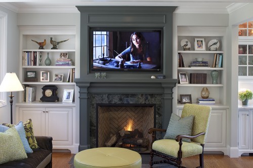
We have a couple of friends who are working on hanging their TVs over their fireplaces. I say working because its not a simple hang job. You have to mount a TV bracket which is a pain in itself let alone when going into masonry. You then have to figure out what to do with the cords which involves some crafty thinking and finish carpentry. Not easy but worth it.

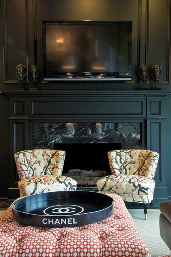
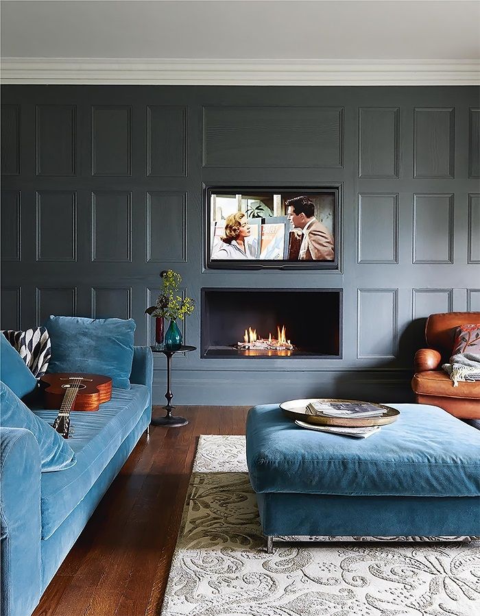
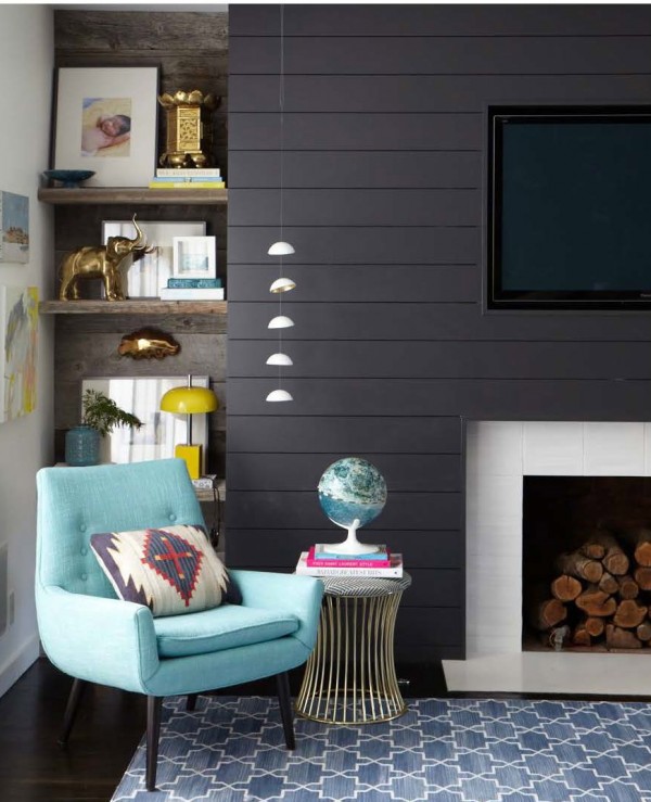
In most cases, the fireplace is the natural focal point of a room. That is until you introduce a TV. Then, of course, it steals "the show" - get the pun? So if a TV and fireplace are each in their own respective locations, you not only have two focal points you also end up ignoring the second runner up - the fireplace. The furniture layout also becomes awkward because you either are trying to orient to both the fireplace and TV or its like the fireplace (or maybe the TV in the rare case) becomes out of place in the room. This is all to say, that I am a proponent of a TV over the fireplace - one focal point with a clear room orientation. I won't pretend that a TV doesn't take away from the architectural beauty of a fireplace because it does. But for me (a person who watches TV), the practicality of incorporating the two together wins over this particular aesthetic point. I also think that people who have their TVs over their fireplace end up making more fires (which I am also a big proponent of). There is a caveat to this design solution which is your room has to be deep enough so that you aren't straining your neck to look up at the TV. And your TV also obviously has to fit above it. Finally, I will say there are no strict design rules as each room, its function and its users are unique so first and foremost do what works for you. 

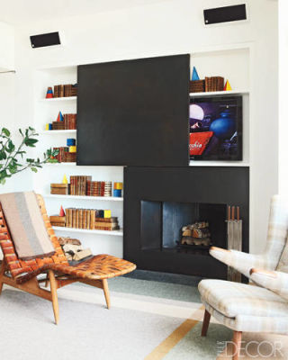
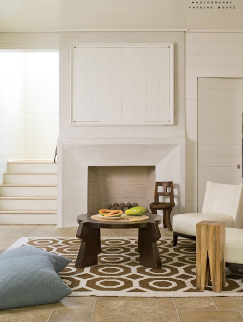
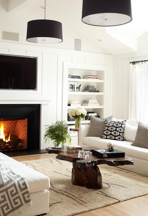
With a TV over a fireplace, you really have three design approaches. One, you can hide it. 

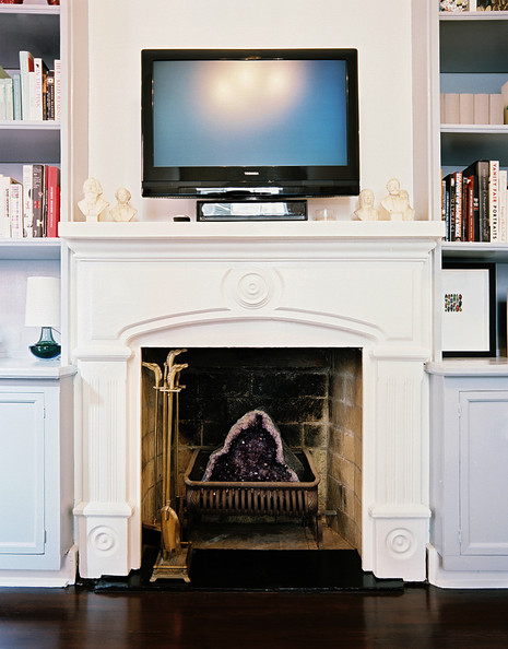
Two, you can completely own it. Yes, I watch TV and there it is!

Three, you can minimize its effect. 

I think all three can work and it really just depends on the overall room design for what makes the most sense. I will say that cords always should be hidden!

Have a great weekend everyone and stay warm!

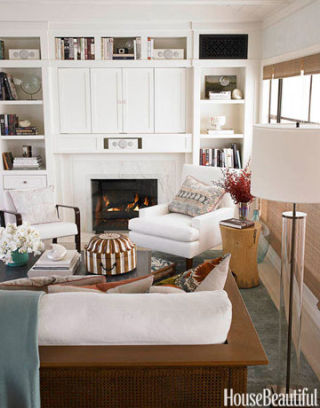
hiding TV: via Elle Decor - via Carla Aston Designs - via House Beautiful - via A Thoughtful Eye
owning TV: via Lonny - via Lonny - by Urrutia Designs - via I'm Busy Procrastinating 
minimizing TV: via The Little Green Notebook - source unknown - by Emily Hendersonvia Carla Aston Designs