 asdfsdf
paint color for our living room
Emily Oster
We are dangerously close to starting our first floor renovation. So much so that I think its safe for me to start to consider things like paint color! Of course, I have an idea of what I would like to see in the room but narrowing it down to the exact shade is a whole other thing. When it comes to paint selection for this room, I have known since we bought the house that I wanted to do a darker contrasting trim. Back when we were using the space as our dining room, I liked the idea of doing a dark grayish blue color. But then, we painted our den Normandy - a darker blue - so that just seemed like too much. From there, I moved onto dark green and up until recently, I thought that this was the direction I wanted to go in. But now, I have had a change of heart and am thinking something more neutral. I like the idea of opening up the possibility to different accent colors in the art, pillows and chairs. One of things I have discovered having a darker room - our den - is that it is harder to hang art. While the room looks more "complete" with the blue walls, I have had to be very selective in what to hang ie there is nothing currently on the walls. With our living room, I want the freedom to put up family pictures, favorite photography etc. and not be as limited. I also want the room to really flow into the back hallway (which will be white) to create the illusion of a bigger space. Below are some inspiration images I am referencing as well as some paint colors that are under consideration.
source unknown
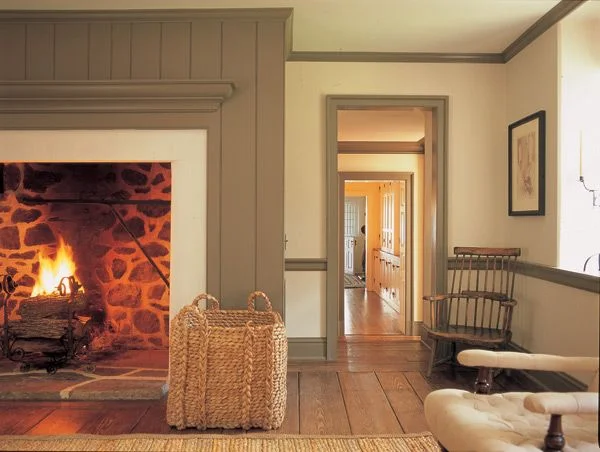
This is my leading inspiration image as its the closest to what we actually have/will have in the room - chair rail, base, crown and a vertically paneled fireplace wall (I wish our fireplace opening was going to look like this!). I would describe the color as a beige with some gray and green in it. Our floors are mid tone like the ones in the image (not the amazing wide plank though) and the color seems to nicely bridge between warm and cool tones.
When starting to thinking about paint colors for any space, I generally turn to Farrow & Ball first. Their more limited color palette is spot on and provides for a jumping off point if nothing else. For our living room, I was initially interested in Hardwick White, French Gray, Lamp Room Gray, Purbeck Stone and Pavilion Gray. When looking at paint colors, I always look for install images to see how the color seems to play out. With beiges and grays, its important to try to gather what the light is like when looking at reference images as these colors can change dramatically depending on their environment. From some image sourcing, I ruled out French Gray for being too green, Lamp Room Gray for being too blue and Pavilion Gray for being too cool in tone.


1929 Farmhouse design by Rafe Churchill

via wendell
I am leaning towards the Hardwick White but plan to order sample pots of both just to see how they look up on the wall. I also am interested in Benjamin Moore's Revere Pewter which is probably one of the most popular grays out there right now.

Revere Pewter by Benjamin Moore

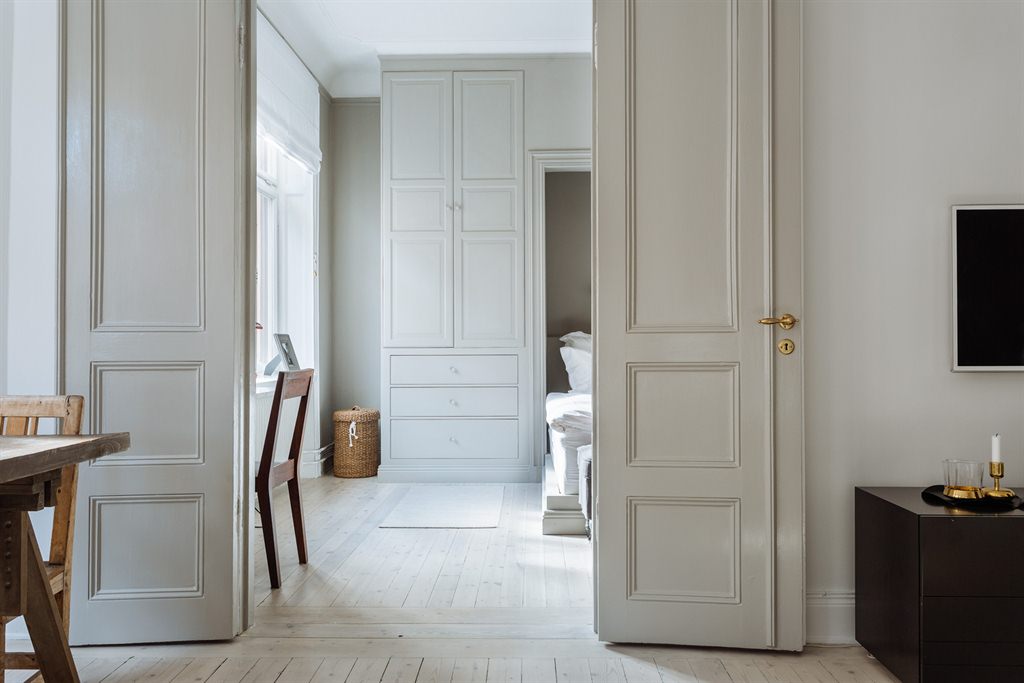
design by Taste Design Inc. via Home Bunch
I plan on pairing our "greige" trim with Benjamin Moore's Swiss Coffee on the walls. I have been using this white throughout the rest of the house and want to be consistent. I feel like I am still open to other colors at this point but am going to at least get samples of the three above and go from there. Paint can really be so hard!
Want to read more? Check out one or all of these related posts.

picking paint colors
november 15, 2013

michigan + half painted walls
july 28, 2015

vintage inspired wallpaper
november 12, 2015

