contact us

Whether you are a homeowner, an industry professional, fellow blogger or just curious to know more about the place home, we are excited to hear from you. 

Email us directly at theplacehome@gmail.com, connect with us through social media or submit the form!


123 Street Avenue, City Town, 99999

(123) 555-6789

email@address.com


You can set your address, phone number, email and site description in the settings tab.
Link to read me page with more information.

THE-PLACE-HOME-blog-banner-final.jpgasdfsdf

blog


Filtering by Category: the beautiful home

etsy lighting round up

Emily Oster

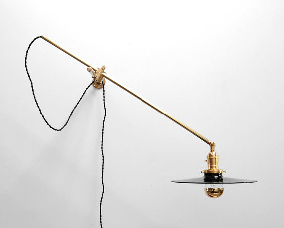
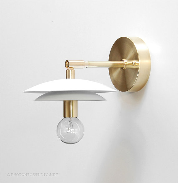
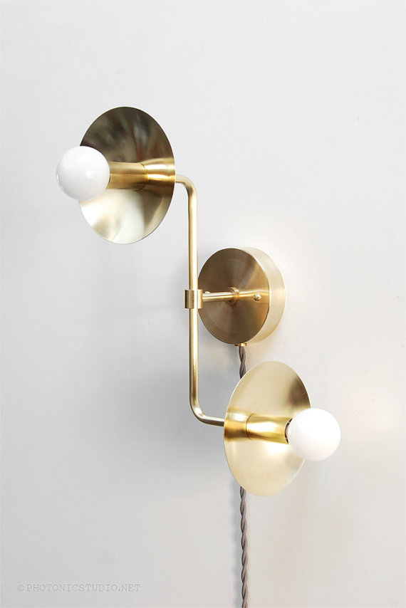
Recently, I have been seeing some really great lighting on Etsy. Shopping Etsy usually means prices are to more competitive, customization easier and you get to work directly with the maker - which I am all about. These can all be real advantages when it comes to lighting as its not always the easiest of purchases. The sellers can help you answer such questions as will the piece give off enough light for the room/desired use, is the scale appropriate, how to install etc. 

Below are a few finds. 

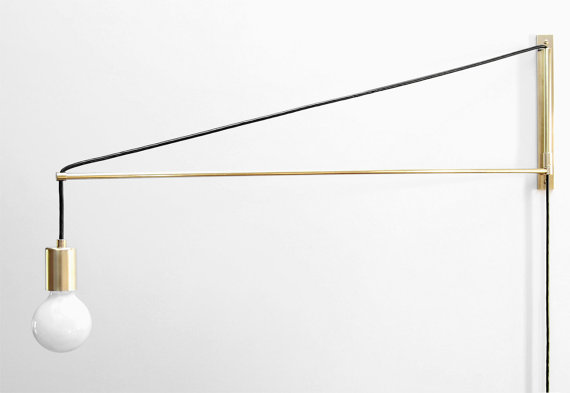
1. Photonic Studio

I really like the reduced, industrial quality of this studio's lighting. The pieces are simple but still interesting and priced well too!

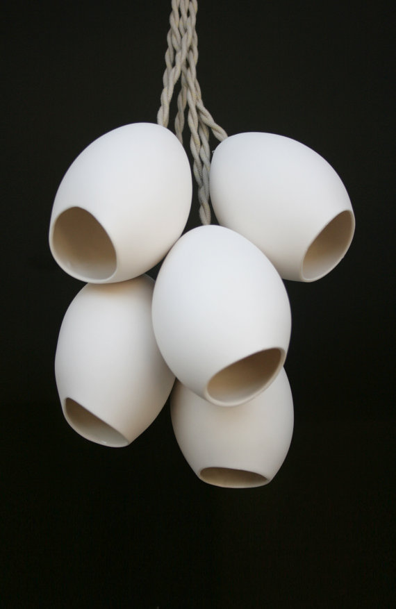
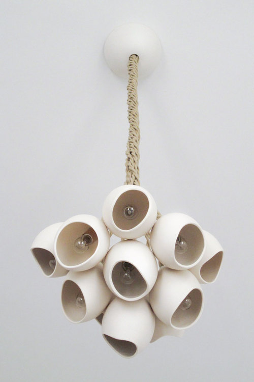
2. Light and Ladder

Light and Ladder currently only offers one style of light but its a beautiful one. Made from porcelain and rope, I am pretty obsessed with it. Check out their website (or Etsy shop) to see their planters and other home decor items. 

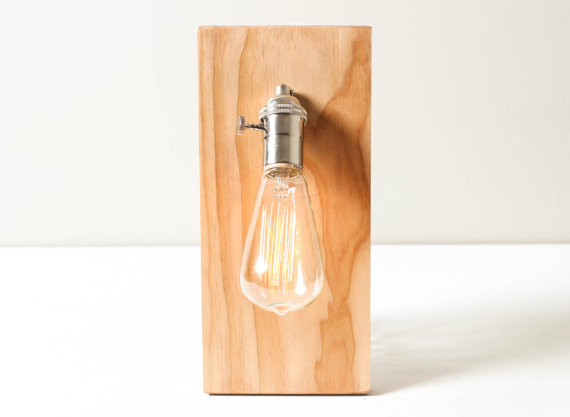
3. Worley's Lighting

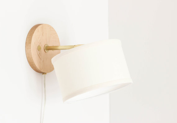
Making pieces from wood and brass, Worley's Lighting has a nice selection of sconces and lamps that are available in four different wood stains. I could see the top sconce looking so cute in a boys room or in a cabin setting. 

For other lighting related posts check out lantern lighting, the amazing design work of the firm Bocci or this post on rattan lights

chocolate brown walls

Emily Oster

I am helping a friend with her recently purchased new home and am trying to convince her to paint her basement family room brown. Yes - brown. A deep chocolate brown that is chic, unexpected and timeless. She is having a hard time visualizing the color so I thought I would do this post to help her out. See brown walls can be so good!

Perhaps no other designer creates better spaces with a brown backdrop than Tom Scheerer. He is a complete master - not to mention one of my absolute favorite interior designers.  Brown works well to highlight other colors such as purple and blue while keeping the base color of the room neutral but also impactful. In short, its a classic choice so embrace the brown!

from top left - via Country Living - via The Design Chaser - bedroom designed by Tom Scheerer - entry in home of Tom Scheerer - living room designed by Tom Scheerer - chair with pink curtains in room designed by Tom Scheerer - hearth room designed b…

from top left - via Country Living - via The Design Chaser - bedroom designed by Tom Scheerer - entry in home of Tom Scheerer - living room designed by Tom Scheerer - chair with pink curtains in room designed by Tom Scheerer - hearth room designed by Tom Scheerer - home of Paloma Contreras via La Dolce Vita - office designed by Tom Scheerer - dining room designed by Tom Scheerer

new uses for antique display cases

Emily Oster

In my search for an armoire for our master bedroom, I have come across some really cool antique display cases. However, being that these pieces are generally quite large - I was unsure of how one could really incorporate them into a more modern space without them looking overly cluttered or just out of scale. Then, I saw this amazing kitchen in Lauren Liess' new book, Habitat: The Field Guide to Decorating, in which she had repurposed an old glass front bookcase as upper cabinets. Everything else in the space was crisp and new making the antique cabinet a beautiful accent element that defined the room. Unfortunately, images of this particular kitchen are not yet available online. So I did a little digging and found some other really great examples of how one could use antique bookshelves, curios, cupboards etc. in a fresh and current way. 

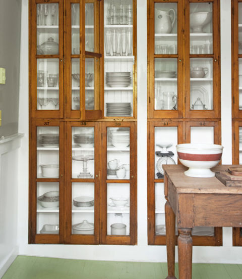
I have long admired this image that uses old locker doors for a glassware pantry. I like how the doors are part of a built in unit making them really stand out against the white framing.

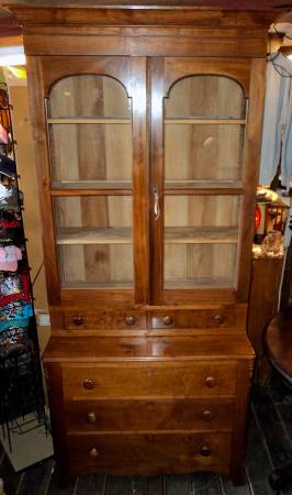
I could see achieving a similar look and one that is much like the kitchen Lauren Liess designed by using this sort of antique bookshelf. You could just use the doors or hang the whole unit as an upper cabinet. 

This Drexel Heritage piece could also be used in a similar way although I would probably re-stain it as the color looks a little off to me.

If space allows, using a big display case can make a dramatic impact especially if you stock it with beautiful and useful kitchen items like the examples below.

design by SR Gambrel

design by SR Gambrel

With something so large, I think you would have to look for old commercial or retail pieces as the ones pictured above seem beyond residential scale to me.

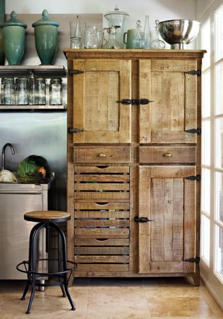
For smaller antiques cases, check out these inspiring spaces.

source unknown

source unknown

Ranging from rustic to more refined, these current Craigslist listing could be beautifully integrated into a new kitchen for a similar look.

For posts about my finds and searching Craigslist click here, for general kitchen inspiration check out this early kitchen post or to learn more about the design work of Lauren Liess click here