blog — THE PLACE HOME

contact us

Whether you are a homeowner, an industry professional, fellow blogger or just curious to know more about the place home, we are excited to hear from you. 

Email us directly at theplacehome@gmail.com, connect with us through social media or submit the form!


123 Street Avenue, City Town, 99999

(123) 555-6789

email@address.com


You can set your address, phone number, email and site description in the settings tab.
Link to read me page with more information.

THE-PLACE-HOME-blog-banner-final.jpgasdfsdf

blog


Filtering by Tag: paint

exterior paint color

Emily Oster

It is a very gray wintry day here in Saint Louis. We got a good snow accumulation Saturday and then it rained last night so things are looking quite brown. It reminds me of Michigan in late March - brown, dirty piles of snow and, of course, overcast. The winters in Saint Louis are significantly clearer than I experienced growing up in Michigan but we still get a large number of gray days. And it is on these days that I really notice some one off house colors. That gray that is really purple or the tan that definitely is light pink or our house's beige color that tints green to look like baby poop.....which is to say I have started thinking about repainting our exterior.

As usual, I am not sure when this particular home project will happen but mostly likely it will be during the warmer months. This means, however, that I won't have the opportunity to test colors in the flat, tricky light of winter. As such, I plan to keep an eye on house colors in the neighborhood that I like, research what palettes look the best all year round and then finally photograph our house in multiple lights - times of day and seasons - so that when we are selecting colors I can remember not to select anything that might even come close to looking like it came out of Booker.....

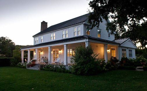
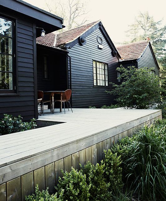
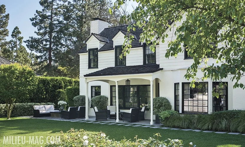
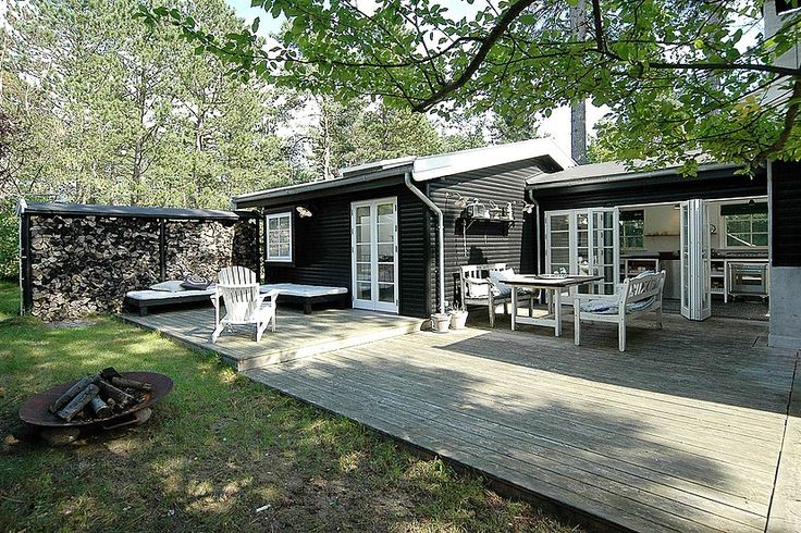
In the meantime, I have gotten the search going by just looking broadly at different exterior color palettes and checking out REMODELISTA and GARDENISTA for related posts. The first two colors I instantly gravitate towards are white and black. A white house is just classic and a black house is unexpected yet timeless as well. 

Or a white and black combo.

The problem with white is that our house exterior is stucco and I am worried about the maintenance as well as how much it will emphasis the rough texture. The challenge with black is that I would have a really hard time convincing Jeff to go for it and it might be even a little daring for me. 

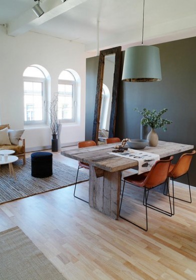
I also like the idea of a really dark green. 

It would have to be just the right shade - not too blue and not too light. It is really hard to find examples of well done dark green exteriors so that makes me a little nervous as well. 

Then, of course, there is the overwhelming idea of doing gray or tan. The two are probably the most popular selections but there are just so many shades of each that I get dizzy just thinking about it.

Clearly this is going to take a while....

from top: source unknown - source unknown - original architectural design by Gerard Colcord and renovated by Tom Boland via Milieu Mag - source unknown - design by Bill Ingram Architects
house updates + templeton gray

Emily Oster

A few updates on our house...

  1. We got the Stendig chairs! As I wrote about in this post, I found such a deal on 4 side chairs (no arms). I then did some digging and was able to find another set for not as great of deal but still pretty good. So we now own 10 matching dining room chairs (5 armless and 5 with arms)!  I have been looking for dining room chairs for so long its sort of crazy that we now have a complete set (remember this postthis post and this post?). Of course, things are never that easy as the chairs are currently in Michigan with my parents and I have yet to figure out how to get them to Missouri...
  2. I am still painting the landing. I have put in probably 12 hours so far and I don't even have the first coat of paint on the trim completed. This is the first area where I have attempted to do something with the old, thickly painted trim and it has been much more time consuming than I planned. I opted for what I thought was a partial improvement strategy meaning I didn't strip the molding or rip it out and replace it. Nor did I just leave it alone and paint straight over it. Instead, I used Durham's Pudding to fill in a bunch of cracks and holes and then sanded over it to smooth it all out. What I discovered is that the pudding works pretty well for fixing cracks but not great on major inconsistencies like rough paint areas and damaged plinth blocks. Hopefully, I will finish painting this coming weekend.
  3. We have disposed of only one more mouse since the major extermination spree so I am hoping that the situation has been "handled".
  4. Our basement took in water AGAIN and this time it wasn't after a really heavy rain. So we put the dryer up on blocks and are currently searching for a recommended professional to advise us on what is going on. Best guess is that we need a sump pump.
  5. Our kitchen sink is currently clogged so Jeff will be playing plumber this evening. Because these are joys of home ownership...

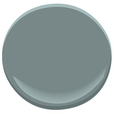
Now that we have gotten reality out of the way, I am currently dreaming of Templeton Gray - the sort of gray more greenish Benjamin Moore color I am thinking of painting the trim and armoire in the other guest bedroom. Since pretty much completing the project room, I have been thinking about what to do with the other guest room. I wrote this post and remember how I thought "it just needs a good coat of paint"? Well, after working on the trim on the landing and taking a closer look at the actual condition of the walls and trim its going to be more time consuming than I thought. I haven't decided how involved I want to get with refinishing the trim in the room but my thought is that if I paint it darker and leave the walls light the poor condition of the molding won't be as noticeable. I don't want to give the wrong idea that I don't care about the quality of the work but in an almost 150 year old house you have to pick and choose your battles. You also have to know that part of an old house's charm is that not everything is crisp, clean, smooth, straight or anywhere near like new. 

I also am in love with the below image of Phoebe Troyer's entry. The color is apparently called Greenbrier from Olde Century Colore. I am not familiar with the company and couldn't find any other examples but it might be worth looking into...Darker and a little more green than Templeton?

weekend painting

Emily Oster

Now that the master bedroom is finished being painted, we can move onto the office.  The space was most likely a sleeping porch at one point and has two walls of windows. Its small but very bright so I wanted to take the opportunity to choose a darker color. I looked at probably ten or so Benjamin Moore and Farrow and Ball colors and let Jeff narrow it down to three. He chose Hale Navy, Narragansett and Lead Gray

Hale Navy is the most blue. I would describe it as a true navy.

Hale Navy via Style by Emily Henderson

Narragansett can go pretty green.

And Lead Gray sort of seems to fall in the middle leaning more towards blue than green.

We haven't bought the paint yet but I am pretty sure we are going to go with Lead Gray. We also need to finish painting the ceiling which has already had two coats of primer and will probably need two coats of Simply White Benjamin Moore paint.

Check back next week for office pictures and project room updates! Have a good weekend everyone!