 asdfsdf
window seat sconce
Emily Oster
I have been attempting to find a sconce for our window seat for what feels like months at this point. Remember this post? Well, the long and short of it is that none of those options worked so I have been struggling to reselect. At first, I was adamant about wanting a down light - something cozy for reading - but now I am not so sure. Modern? Traditional? Black? I am really all over the place.
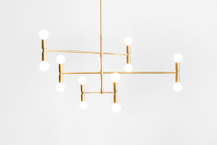
Currently, at the top of my list of considerations is this light by Stilnovo. I am a big fan of their iconic designs which have been around since 1946. I just love the idea of owning such a timeless and modern piece.
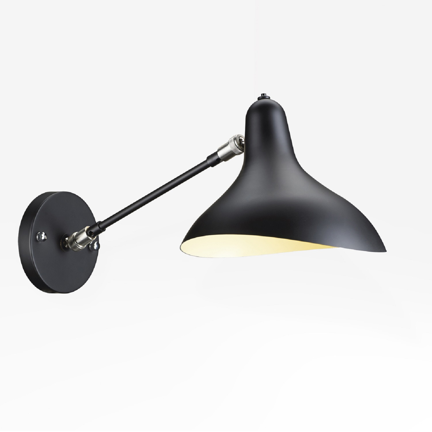
1 Light Wall Sconce by Stilnovo via All Modern | THE PLACE HOME
However, I do hesitate with this light because I worry that it might be a touch too modern for the space. Although on the other hand, the sharp juxtaposition could be an amazing detail...The other drawback of this fixture is I can't tell if there is a switch on it. There is no hardwiring to a wall switch so I absolutely need an on/off on the fixture.
Having sort of a similar look to the Stilnovo is this light by Suri. It has a fixture switch which is great and I like that its styling falls somewhere between modern and a bit industrial. It's downfall is that it is listed as being oil rubbed bronze as opposed to black. If its really dark and the red tones are not super noticeable this isn't a big deal for me but if it lends lighter then its a no go. Also it seems a little large at 10"H x 13"W....

suri wall swing arm sconce via Overstock | THE PLACE HOME
On the complete opposite end of the spectrum, I am also thinking about this traditional sconce by Restoration Hardware.

petite candlestick sconce with linen shade by RH | THE PLACE HOME
Its basically the safe and easy choice. I know it has a switch and I could order it today and always return it if I didn't like it. It would be a completely different look than the first two options but it could be nice as well. I am still searching so if any readers have recommendations send them my way!
Want to read more? Check out one or all of these related posts.