nursery series | boy or girl
Emily Oster
As I have mentioned in this post and this post, we weren't sure about finding out the gender of our baby. And while I didn't REALLY source/decorate the room before we found out, I knew what direction I was headed in if it was boy or if it was a girl.
For a boy, I liked the idea of mixing reds and navy with the BM Caldwell Green paint color. Red is pretty out of my comfort zone but I did and still do really like the way a true red looks against the green. I pictured a room that had a cool, somewhat expected, vintage vibe. Similar in feel to these great boys rooms...
design by Amber Interiors | THE PLACE HOME
design by Bailey McCarthy via Style Me Pretty | THE PLACE HOME
Wixom home via Camille Styles | THE PLACE HOME
via One Kings Lane | THE PLACE HOME
For a girl, I initially loved the idea of doing a blush and dark green room. Emily Henderson shared this mood board for her daughter's room which is a bit more boho than I was thinking but still amazing.
design by Emily Henderson | THE PLACE HOME
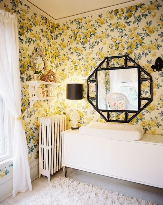
Ultimately, the more I thought about the more I realized so much pink just wasn't us. Don't get me wrong I love blush and consider it one of my "power colors", I just didn't want to be so tied to it. Similar to my thoughts for a boys room, I wanted a nursery that had a vintage feel but mixed with more modern elements. A space that was a bit whimsical and romantic - sort of like the feel of these sweet girl's rooms...
via Inside Out Magazine | THE PLACE HOME
home of Miranda Brooks and Bastien Halard featured in Vogue via The Neo-Trad | THE PLACE HOME
design by Lisa Sherry via Lonny | THE PLACE HOME
Having an idea of how I wanted the room to feel was big in being able to quickly move forward once we found out we were having a girl! And what is more romantic and whimsical than a modern chintz!
Want to read more? Check out one or all of these related posts.


